Home-->m-master-4-054-eng
|
||
Master-4-054 How to make mobile web site - a simple and practical method |
||
Is
it hard to make a mobile site? Do not! Here I will tell you a very simple
good way. |
||
Overview:
In recent years, the mobile phone's memory and network speed has caught
up with even more than the PC, making a mobile web sites no longer requires
complex and unfamiliar WAP languages. On the basis
of the traditional website (HTTP language), just add a self-adaptive function
with window, all the problems are solved. For a practical personal web
site,you can completely abandon many of the esoteric procedures similar
to jQuery, PhoneGap,
and Div, CSS, Frames,
templates, forms....Only using layout in tables, to create an excellent
mobile site. Dreamwerver
CS6 has provided us with a very simple program! |
||
1.
Basic conditions: |
||
1-1
You have produced a traditional website (for PC), know how to use Dreamweaver
software (any edition) . And the Dreamweaver CS6 software has been installed
on your computer |
||
1-2
You have a space and a domain name of your own (Or your old web site's space) |
||
1-3
You have a mobile phone that you can access to check the effects of production
at any time |
||
2.
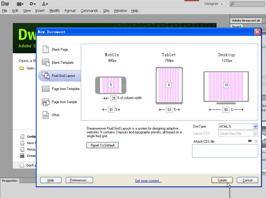
Now, let's get started! First
open CS6, File -->Create a New Fluid Grid Layout -->Select the default
"HTML5" in the document type (Lower
right corner) -->Create (This is the most critical step) |
||||||||||||||||||||
 |
||||||||||||||||||||
 |
||||||||||||||||||||
3.
A new window will be appeared asking
you to save a file named Untitle-1.css, please save it in a new folder
for your mobile site, for example, the folder's name is 001-mobile (It can be a separate folder, can also be placed in the inside of your
old website folder |
||||||||||||||||||||
4.
A page of fluid grid layout begins to appear,
the pink upright bar is representative of this mode, it will not appear
in the browser, so do not ignore it. The top of green bar and text is just
a tip, it is not necessary for us, so need to delete it |
||||||||||||||||||||
 |
||||||||||||||||||||
5.
In the top of the CS6 click "modify" -> page properties, the following window appears |
||||||||||||||||||||
 |
||||||||||||||||||||
The
left side has 6 columns, each of which can be modified. The main is the
first column "Appearance [CSS]" and column 5 "Title / Encoding",
please revise them according to your needs. The most important thing is
Encoding, the default encoding is UTF-8, it is for English-speaking countries.
You can revise it to suit your environment. |
||||||||||||||||||||
6.
Back to point 4 of the window, we need to set a basic model (or called the framework). There are many complex
frame mode, I think we only need a simple, practical model by way of layout
in tables:
I call it banner combination with three sections. |
||||||||||||||||||||
It
is very simple and no need to use any program: first place the cursor in
the middle position in the page window (see point 4) (Click on the top of
the "Format"--> Align, and then select "Center").
Select "insert" -- > "table", insert a table with
4 rows and 1 columns, the width is 98%, border thikness is 0. Next, insert
a table with 20 rows, 1 columns, the width is 98%, border thikness is 0
and insert again a table with 6 rows, 1 columns, the width is 98%, border
thikness is 0, total 3 sections. |
||||||||||||||||||||
Well,
final save the file (you can name it template-0000.html)
to the "001-mobile" folder, at this
time, a window will pop up as shown below |
||||||||||||||||||||
 |
||||||||||||||||||||
Click
"Copy" to save the template-0000.html file,
this basic page (or template) is complete. You can use this page as a general
template to edit all web pages for your mobile web site, accordiong to your
need to insert text, tables, pictures, a variety of links (including audio,
video) and so on, then upload them to your server by way of FTP, use your
domain name, through the browser you will can browse these pages with self-adaption
function. |
||||||||||||||||||||
The boilerplate.css
, respond.js and Untitle-1.css (See third point) are 3 important
system files, they contain all the web settings (CSS and so on), you must
upload them to your server. If your settings are modified, you must re-upload them in order to take
effect. |
||||||||||||||||||||
Here
to illustrate the role of the three sections mentioned above: first section
(a table with 4 rows and 1 columns), it is reserved for the site's header,
in order to insert the site logo, the main column (and link) and the search
engine, etc. Here are two screenshots of my mobile site as an example ( ../index-m-eng.html ). First screenshot is in the mobile phone, and second is in my PC: |
||||||||||||||||||||
 |
||||||||||||||||||||
 |
||||||||||||||||||||
You can get an intuitive
feeling for the self-adaption function through the comparison of the two
screenshots. It can automatically adjust the size of text, tables, and
pictures etc. So that people can easily and comfortably browse in different
devices. |
||||||||||||||||||||
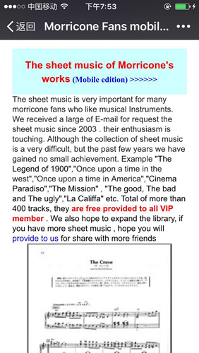
Second
section (a table with 20 rows and 1 columns) is reserved for all contents
of web site. ( You also can increase the number of rows, or increase a new
section under
the second section if the contents is very many),here
are 2 screenshots of my mobile site as an example |
||||||||||||||||||||
 |
||||||||||||||||||||
 |
||||||||||||||||||||
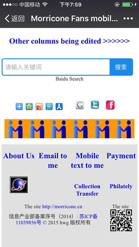
Third section (a table
with 6 rows, 1 columns ) is reserved for the bottom of web site. It includes
some of the auxiliary column of the site. Here are 1 screenshot of my
mobile site as an example |
||||||||||||||||||||
 |
||||||||||||||||||||
Well,
my introduction to this end! You can study them and own decisions about
some of the details. You also use more function example CSS or framework,
database....if you hope. You sould constantly observe it to use your mobile
phone or PC for to get better results. You
also send email to me if you need. |
||||||||||||||||||||
Finally
make some further instructions: |
||||||||||||||||||||
1.
Do not tie two images together in any time, you can put them separately
in the upper and lower rows. The table do not exceed 3 columns, preferably
two columns. Otherwise the page will be very ugly. |
||||||||||||||||||||
2.
Search engines and traffic statistics are required. Please choose them according
to your actual situation. And put them in your template (template-0000.html)
for whole web site |
||||||||||||||||||||
3.
About audio and video: The use of audio is not any problem, but it It does
not support embedded video (<emded ........./emded>). But you can
use the link to open the video of many video web sites in the another web
page. Of course, if you have big space to upload your own video, you can
use CS6 insert video function. |
||||||||||||||||||||
4. On the transformation of the old site: There are many different
ways for the work. But I think It is a good idea to coexist with the new
and the old site. Because the mobile web site can not be placed too much
content, and mobile phones and PC will coexist for a long time. According
to my practice, it is possible that new mobile website and old PC websites
are stored in a folder. They can live in peace. Please open the following
three links in accordance with the order, you will fully understand my settings,
it is very simple and practical: |
||||||||||||||||||||
1.
New home page, it use old domain name ../index-eng.html  |
||||||||||||||||||||
2.
New mobile site ../index-m-eng.html  |
||||||||||||||||||||
3.
Old PC site ../index-PC-eng.htm  |
||||||||||||||||||||
Because
it is a Chinese English bilingual website, so more complex. For Chinese
web pages, it is like this: |
||||||||||||||||||||
1.
New home page, it use old domain name ../  |
||||||||||||||||||||
2.
New mobile site ../index-m.html  |
||||||||||||||||||||
3.
Old PC site ../index-pc.htm  |
||||||||||||||||||||
The
End |
||||||||||||||||||||
Dec.13,2016 |
||||||||||||||||||||
|
||||||||||||||||||||


